HOME | DD
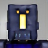
 timsilva — ORBGasm

Published: 2010-05-26 11:40:38 +0000 UTC; Views: 17546; Favourites: 100; Downloads: 942
Redirect to original
Description
For Sale: [link]The sexiest orb on the internet, pun intended.
 (Smile)")
Update (June 6th, 2010): I removed the enimak logo from the center of the orb. I felt it was taking away from the beauty of the design. You can view and enjoy all of the other versions and variations of this concept on my archive:
Archived Progression of ORBGasm & Other Variations
Story: I wanted to create the coolest orb possible with my skill set and combined influences. I've gathered inspiration from The Skins Factory, Cosmo (Jimmy), and Lance/Spencer (of GUI.Station) for this one, and I cooked it with my own spices and touches as well.
Related content


Comments: 88

Is there a working version of this. I'd love to add it to my skins library.
P
👍: 0 ⏩: 1

It's just a visual design concept, doesn't work as an application. Maybe one day.
👍: 0 ⏩: 0


Love the orbs and the microlights, not digging the chrome effect on the side though. Sort of cheapens the whole piece, but other then that...WOW, nice orbs baby....yeah! *austin powers style*
👍: 0 ⏩: 1
Thanks a bunch!
If you read the description you will see a link to a hidden folder on my website that contains different variations. More than one of them has the chrome effect removed.
 (Wink)")
👍: 0 ⏩: 0

Nope. It's Keily. I'm doing some recruiting for Guifx.
👍: 0 ⏩: 1
Oh hi there. Sweet, glad to hear that I'm review-worthy.
👍: 0 ⏩: 0

This is so clean
👍: 0 ⏩: 1
Thanks for the fav, comment & watch Cosmin.
👍: 0 ⏩: 1
Well, that's something you deserve it
👍: 0 ⏩: 1
I'm glad to hear that you found them useful, hopefully I will have many more of them in the future!
👍: 0 ⏩: 1
Thanks for the +fav and comment Mike.
Anything new coming from you soon?
👍: 0 ⏩: 1

No worries, I think making the perfect orb is kinda like the search for the holy grail. ")
I have lots of new stuff, mostly just proxy & joomla web templates, but I always forget to post them here on dA. The most recent finished design that's online was probably for stopmalvertising.com. I want to get back into doing more fun interface stuff though.
👍: 0 ⏩: 1
Yup, the perfect orb doesn't exist, but we are always searching for it.
Stop Malvertising looks great! I really look forward to seeing more of your work. Maybe you can join the encide battlebay this year.
👍: 0 ⏩: 0

You and I both like orbs it seems, but I have to admit yours look better. Good job Timmeh.
👍: 0 ⏩: 1
Thanks Fredrik.
Have I invited you to encide yet by the way?
👍: 0 ⏩: 1
Don't think you have yet. You're welcome to do so though.
👍: 0 ⏩: 0

I haven't even seen the first one, haha. Does this remind you of that series or something?
👍: 0 ⏩: 0

Very nice yo. I don't think I got to see the original, but I as well would prefer this without a logo. To have a logo is fine, it can add to the design but sometimes it just covers the design. This way, we can appreciate the...'orb' xP
👍: 0 ⏩: 1
Yeah, that's how I felt. It was hiding the beauty of the orb.
The original can be found here: [link]
👍: 0 ⏩: 1
It doesn't look bad at all, but it indeed takes up much of the focus.
👍: 0 ⏩: 1
I wonder if someone with 3 orbs will be able to walk?
Looks great.
👍: 0 ⏩: 1
Haha, probably not, at least for a few seconds. Thanks!
👍: 0 ⏩: 0

Remove the enimaK logo to show its beauty!!!111
Great work Tim.
...I can't find Spencer's work.
👍: 0 ⏩: 2
Removed the logo. You were right, I like this better.
👍: 0 ⏩: 1
Giving that some legitimate thought.
Spencer's site is offline.
")
👍: 0 ⏩: 0

Hahahahaha, you're very funny !! Nice comment artist !!
Obviously, this is awesome !! Very Pro !!
👍: 0 ⏩: 1


AWESOME! Ide like to see it in green or red though
👍: 0 ⏩: 1
Thanks Anil.
👍: 0 ⏩: 1

Means a lot coming from you Rob.
👍: 0 ⏩: 0

| Next =>