HOME | DD
 Rotschmetterling — Horsea Design Swap

#alola #blau #blue #design #hart #idee #johto #kalos #kanto #muster #pattern #round #seahorse #soft #weich #eckig #seeper #sinnoh #unova #hoeen #seepferd #seaper
Published: 2019-07-02 17:00:16 +0000 UTC; Views: 11630; Favourites: 233; Downloads: 7
Redirect to original
Description
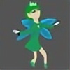
Ich habe so ne idee zu pokemon ,was wäre gewesen,wenn wir 1999 Seeper nicht kennenlernen konnten und es erst mit einer anderen Generation rausgekommen wäre.Das ist kein doofes meme oder unspektakulär ein seeper tauscht mit nem anderen pokemon farben u form.Die Bilder sind selbst erklärend wie gewisse Designschema per generation auf seeper auswirken,dad ist weder die korrekte darstellung wie es wirklich passiert wäre aber schon 60% was die idee dazu angeht meint ein pro.Bei einigen stimmen die Größenverhältnisse nicht aber es ist wahr,dass in Gen 2 eher simple rundeformen in waren und bei gen 5 so leicht langweilige schnelle kleine körper mit großem kopf.
Johto: Eher scharfe unrealistische formen ,möglichst oft punktaugen oder wolkige formen.
Hoenn: Darstellung ist genauer mehr farben u details zu sehen,man kann bereits wieder zackige formen und schildartige muster sehen.Hoenn hat wieder versucht genau zu sein.
Sinnoh:Wirkt so zeitgenossen artig also zeigt komplett wann und warum es da ist.War bei einigen pokemon in sinnoh der fall,dass man unscharfe referenzen zu spielen u serien erkannt hätte.(Lucario-sonic,Panferno-dbgt,darkrai-devilamay cry usw.)
Einall:Sehr lumpige ungroßartige Darstellung,kopfhörerartige kopfflossen zu großer kopf,altmodische darstellung von augen ,extrem einfacher körperbau.Sonderlich viel hat man sich bei gen v nix angetan.Man wollte zwar extrem viel neues testen wie texturen nur viel es zu flach aus und meist schlecht was details angeht.Die öden farben bei gen 5 fehlen hier.
Kalos: eigentlich vom aufbau her sinnoh reloaded,wieder zeitgemäße formen kombiniert mit hässlichkeiten memes und extrem viel kanten ecken händen streifen und groben strukturen.Lieblose riesenköpfe bei basispokemon idiotischer hingekritzelter embryokörper bei startern.Seeper wirkt hier noch nett.
Alola: In alola sieht man sehr viele freiheiten werden genutzt ,sei es viele bunte farben,größe körper,lange details oder möglichst simple zusammengesetzte formen mit ein bisschen make up.Oftmals haben augen keine kontur oder schattierungen,nur was das potenzial bei alola so versaut hat sind die sinnlose tutorialstunden und einige hässliche pokemon.
Galar: das ist wirklich nur theorie,aber man kehrt zum alten zurück seeper kriegt wie man sieht einen sehr gewellten körper,schönere flossen als bei gen 5 u 6.Detailgenauigkeit hängt vom pokemon ab aber trotzdem wird vieles sehr einfallslos wirken.Ich mein die präsentation von imper u yamper zeigen einen von yugioh etwas abgeschauten kartenartigen zwerg und einen shinyköter,der aussieht wie son brotwecken.
Wer zur idee beitragen will idee kann ,sollte einfach die pokemon design philosophie lesen und sich ein anderes pokemon nehmen.
-------
As you know there are several designs existing of pokemon which includes patterns which were significantly shown .I thought of Seaper and its outcoming on a later shown generation.Maybe it would have been different too now in colours as well but I just got the motivation to swap designs.It wasn't easy because studying 800 designs and 8 different schemes is hard!So I had to choose from some significant pokemon presenting the pattern of the full generation.
I can't guarantee if those outcoming would be 100% been done that in a If all pokemon swaps the generation in design and possibilities but a profi said to me 60% would be very fair for the shapes.Colours would be surely different but I wasn't so extremely passionated to fix them too for each gen.
Johto: simple smooth forms,black white eyes and a zigzag on the fins are probably realistic or possible for seaper here.The more cute head shows up on what johto pokemon generally were made for:kids.
Hoenn:The details are coming back but with more exact ideas as stripes rings,colours and surely a shieldlike body on the belly.The headfins and the back got a more and longer detailed form.wow,I am impressed by it,but I am sure that hoeen pokemon would have more potential to be more realistic by removing the 30 ugly ones out.
Sinnoh:As most sinnoh pokemon are based on very blurred reference characters or shows i tried to put avatar into it.(Lucario-sonic,Pancham-DBGT,Darkrai-Devilmaycry)Most ideas were time based as well so what is In or OUt is declared by expression not by lines!Seaper got more smooth body but strange stripes.
Unova:It is very fair to say unova had a lot of dull designed things because nintendo were able to do better for ds games.The sprites were boring flat coloured and the animations could have more fluent parts or less frames.Seaper is here very big headed a bit useless looking with retro bored eyes and too small body.Unova showed this on a lot of pokemon but also many new patterns,lines and simplified feet on new ratatta,bird route 1 clones and others.
Kalos:This generation was filled with Sinnoh reloaded like designed ideas,mostly based on stupid memes and boring shows from 2010s.Maybe this is the main reason many player hated most pokemon...The colours are ok the only new input here was some outline free designs and lot of experiments.
Alola:A lot of freedom used to be here,colors were high different,formes are very variable but sadly some ugly pokemon did come up.I mean another object pokemon is annyoing.
The smooth lines and stacked body parts were significantly for alola.Simplification was less than 6 and 5 but still nothing new.
Galar: This is non proofable but will be surely be rewritten if it is false.Galar is going back to design roots of Gen l and ll but they use a lot of curved stacked ideas.The seaper is more realistic meand as gen l you can slowly see a genl seaper again just more details and a higher resolution on fins and tail.
If you want to do something similar just try out another pokemon which isn't hard to draw or colour to make people understand that the best Generation doesn't mean the best design,this also go for the most worse generation.I thought often All ugly kalos pokemon shown in 2000 instead of johto and no one would have bought it.Also when Unova and Kanto switch time places,they would have lost a lot of atupid pokemon.A profi artist said,it would never been possible to get such starters again,because people in 2010 were clever enough to find the through meaning out and would rate it as too childish or school like based...
Seeper c nintendo
Picture of kanto is dream world picture
Related content


Comments: 40

I feel good and you?
👍: 0 ⏩: 1
I feel good, thanks
👍: 0 ⏩: 1

danke,es war nicht leicht auf sowas zu kommen
👍: 0 ⏩: 0

👍: 0 ⏩: 1
thx for so much appreciation
👍: 0 ⏩: 0

alola looks like it came from nights into dreams because of the bedroom eyes
👍: 0 ⏩: 1
yeah this was my idea,that it fits the moon thing more than sun,because real seahorses are more night active
👍: 0 ⏩: 1
did you play the game nights into dreams?
👍: 0 ⏩: 1
No never,is it available for switch or ps4?
👍: 0 ⏩: 1
nah only sega saturn and remastered version ps3 and xbox 360
pc
👍: 0 ⏩: 1
oh I have seen it once but never got it
👍: 0 ⏩: 0

Good morning friend, very adorable!!!!!!!!!!!.
👍: 0 ⏩: 1
ty a lot
I hope I can do more later
👍: 0 ⏩: 0

ty a lot
Maybe I'll do more when they are so high wanted
👍: 0 ⏩: 0

👍: 0 ⏩: 1


Its name is Horsea,though. But Seaper sounds more cute.
👍: 0 ⏩: 2
I forgot the english name,I may change it
👍: 0 ⏩: 0

seaper is its name.
horsea is the english name, but seaper is another translation for a different language
its like how Meowth is Nyarth in japan
👍: 0 ⏩: 1
I think you forgot to read when I said ''Seaper sounds more cute''.
👍: 0 ⏩: 1
You dont need to be rude? I was just explaining, I wasnt angry by any means. I just thought it would be fun to have an explanation.
👍: 0 ⏩: 1
I was'nt being rude. I politely think that you forgot the last thing from my comment.
👍: 0 ⏩: 1
you literally arent reading anything i type
👍: 0 ⏩: 0

galar sieht am besten aus und hoenn gefällt mir auch gut ^^
👍: 0 ⏩: 1
ja finde ich auch,hoenn design hätte einige einfache pokemon zwar verschönert aber nich gleich beliebter gemacht.
Ich find sinnoh sieht am süßesten aus
👍: 0 ⏩: 1
es hat 143 faves über nacht gekriegt!
bei jedem bedanken geht nicht 🙈
👍: 0 ⏩: 1