HOME | DD
 RedPear — FanArt - Kimi no na wa

#doki #kimi #na #name #taki #wa #your #yourname #mitsuha #no #kiminonawa #kadoware
Published: 2016-11-26 03:47:38 +0000 UTC; Views: 22985; Favourites: 621; Downloads: 276
Redirect to original
Description
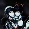
This is the best anime film I have ever seen. The story, the music, graphic and art are SOOO good. The animation is very smooth, too. I am in love. XD
This scene is my most favorite.
I tried my best to draw Mitsuha and Taki in my style but that was hard. T_T
Especially Taki, he doesn't look like Taki in the anime at all.
Well, let's think of them as a cosplayer. Lol
Hope you enjoy~!
C&C are welcomed!
Related content


Comments: 34

👍: 0 ⏩: 0

Overall

Vision
Originality
Technique
Impact
So, I just want to say I love your art but I do always feel like there is something missing in the drawings you do.
1) You've given this character the "Cheeky Look" which has that negative connotation that the character is up to no good. Where as based on the movie, I believe that you are trying to go for the more "Endearing Look." And the reason for this is because you've given him the curved feminine lips along with raising up his lower eye brows. I point this out in particular because many of your drawings share this common expression and while it is not necessarily wrong it can become awkward and can change the meaning you're trying to go for in certain pictures such as this one.
2) You're composition is awkward. You've chosen to tilt the angle of the camera in the viewers perspective and while at times that can create a more dramatic effect, I'm not certain that helps your picture. While I understand that it's probably because you want to show more of the sky it doesn't quite help because what you really should get us to focus on are the 2 characters in front. The fight for the audience is choosing to look at the horizon or looking at the comet and stars in space, but in real life you can't actually see the stars in space when the sun is still shining that bright. Granted it is an "anime" and logic does go out the window you should stay true to natural elements for composition purposes.
3) This ties into number 1 and 2. We're too close to the characters. As an artist you want to bring us close to the characters as possible but never close enough to where you're cutting off part of a character's head from the frame unless you're doing it to both. This creates an imbalance in your composition especially If there are 2 characters that are suppose to be standing equally on the same plain. While the comet and the red string of fate are important, don't put things into the frame just to fill up empty space that shouldn't have been there in the first place. My suggestion is that you should bring us out to a "Medium Wide Shot", that way we can still see the characters and the sky without having the awkward cam tilt that weakens your composition. Even though we're a bit further away, anyone that's seen the movie will know exactly what the guy is doing.
4) Gestures, both of your character's are way too stiff. while the guy's neck is bent. his whole body is completely straight when his should be hunched over more if hes trying to write something small in her hands. You also have his body in a 3 quarter position facing us; if the girl is in a side view he should be in side view. I'll be honest with you, I can't tell if hes looking at what hes writing or if hes looking at her chest and after watching the movie I'm still not sure. Jokes aside you've done a great job.
Your rendering skills great beyond what I can do and probably what most aspiring artist can do. Composition/ Gestures (facial expressions) are what you should work on. Take my rating with a grain of salt, art is so subjective and I really don't like to rate.
Yours truly,
A Fan
👍: 0 ⏩: 0


Uhm, holy crap? Your anatomy is dead on perfect. The light source is visible. There is lots of movement in this piece (The shooting stars, and the ribbon for example.) The purple and blue undertone makes this piece soft and approachable. Since Violet is analogous to blue and red, all the hues go together beautifully. The darker values make this piece feel almost 3 Dimensional. The clothing wrinkles are pretty accurate. There really isn't anything (That I can think of) that you need to improve on, according to the elements of art. The amount of effort and time you put into this really shows. I'm sorry I couldn't be of much help, but I hope you continue making great art <3
👍: 0 ⏩: 0


Thanks
If it's not for a commercial use, you can but please credit back to my blog here.
 (Smile)")
👍: 0 ⏩: 1

Hnngg, perspectives like these with a beautiful skyline are my absolute favorites, but after having watched Kimi No Na Wa too, this is nothing short of a brilliant piece of art!
👍: 0 ⏩: 0

For real the movie isn't really good and I couldn't even find the touching part,the only part which made the characters and everyone cries is the characters forgot each other's name,Taki found out that Mitsuha already dead, and the interest part is when Taki drank the sake that made with the Mitsuha …you know.
I really love the songs in the movie tho XD after I finished the movie I was like "whhaaaaat the hell did I just what ?" Cause I couldn't even find the point or touching part at the first time,not just me most of my friends also feel the same.
Btw nice drawing ! ;w; it's really beautiful —
👍: 0 ⏩: 0

Your art is really great ^^ but although i liked the movie, I thought this scene was so dumb x) i mean, they would have reunited way sooner if he had actually written his name x) it would have saved them sooo much trouble and time x)
👍: 0 ⏩: 1
Yeah I agree with you. When I saw what he wrote on her hand I slipped wtf out of my mouth. lol
👍: 0 ⏩: 0

A great piece of fanart of one of the most beautiful anime film ever!
👍: 0 ⏩: 0


On the browse page, this jumped out at me. It has that somewhat realistic feel to it but, still holds the grace of anime. I simply love it. Fantastic job!
👍: 0 ⏩: 1

I am seriously amazed at how much work you must've put into these amazing effects, background and colour! I love how it's hyper realistic. Great work! I envy you
👍: 0 ⏩: 1
Aww Thank you! glad you love it!
👍: 0 ⏩: 1
You are welcome! I wish I could put that amount of effort into things ;-;
👍: 0 ⏩: 0

Haven't seen this yet, but wow did you draw some beautiful work! I love the background... The shooting stars and sunset add gorgeous. The relationship between the two is so well portrayed here. Not to mention the ribbon's movement is lovely 
👍: 0 ⏩: 1
Thank you so much!!
This anime is a must! don't miss it. XP
👍: 0 ⏩: 0