HOME | DD
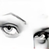
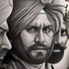 Pen-Tacular-Artist — 'Al Pacino' graphite portrait

Published: 2013-03-28 00:12:30 +0000 UTC; Views: 10548; Favourites: 274; Downloads: 0
Redirect to original
Description
Decided to draw Al pacino as i found this odd but interesting photo of him and i'm really not sure why he has his fingers pointing at his eyes or a rubber band on his hand. This pic also was a good way for me to do big contrats between blacks and whites, which is something i need to really practice. I slightly changed the background from the reference pic as it was a litlle to dark and boring.The drawing was done on A4 Bristol Board paper using standard and mechanical graphite pencils.
Here are some of my other graphite drawings.
Related content


Comments: 72

Overall


Originality
Technique
I would like to start this off saying that this is an amazing piece. If I sound harsh it's only because I view this as a way for you and others to improve their art.
His nose looks really crooked near the bottom.
The iris and pupil in his left (our right side) looks more like an oval than the circle it should be.
The white pieces of hair you have in his beard look out of place with how the rest of his face is shaded. When doing facial hair it's good to have some that are lighter than others, but they have to reflect the way that the light looks with the rest of the piece.
The shading on the wells (I don't know what to call them) on his left hand is a little too dark, so they look too deep.
The hair in the silhouette on the left side of his head looks different than the hair that you have on the other side. Assuming that his hair looked similar on both sides, it shouldn't have as many hairs. It should look similar to his right side, only silhouetted.
The background shouldn't get darker as it gets close to his hands. With the direction of the light there wouldn't be a shadow there, not to mention that he's too far away from it for a shadow to be that close anyways.
You don't have a ridge on the rubber band all the way around. The way that you have it after the little turn thing it does shows that the ridge on the outside of it is on both sides, but you don't have it on the first part.
This is still a great piece with so much detail put into everything that it's absolutely amazing. Most people won't notice most of these things unless they're purposely looking for things wrong with it like I was.
I took off for originality because you copied a photo of him.
👍: 0 ⏩: 0

one of the greatest actors to ever grace the screen, and one hell of a representation of the living light he is. amazing work, raj/
👍: 0 ⏩: 0


OMG! Thats great!! I've drawn a portrait of Al Pacino too, I'll be glad if u take a look at it and say your idea.
[link]
 (Wink)")
👍: 0 ⏩: 0

Woow!! This is looking so realistic!! *OOOOOOOOOOOO* I'm just speechless, the shades, the details... everything!! Great job, as always!
👍: 0 ⏩: 0


Featured in my journal [link] .
Sorry for being late, I am having issues with my PC...

👍: 0 ⏩: 0


As I learnt most of my detailing skill from you, I would like to correct something: While I do agree on most of the points in the critique by CatAttack, I have some personal corrections to add.
Firstly, I saw the original photo and I would like to make my comparisions with regard to that.
The only three things I agree with CatAttack's critique are that the left eye of Pacino looks larger than his right, the color of the facial hair seems a little bluer than required, and you have lighting issues with respect to the background.
The nose, however, is being misjudged. The shadow falling on the nose is from a crooked angle, hence it looks crooked. But if you observe the lines for the nose, you have drawn it perfectly. The angle of the shadow should not have been so crooked, is all. Nothing wrong with the nose itself.
You could tone down the blueness of the hair by running a tortillion very lightly through the area. This worked for me, so I;m sure you'd pull it off handsomely as well.
Coming to the part about the knuckles (wells) on the left hand: they are perfect if you compare it with the original pic. Everything has been shaded brilliantly, and you added details that the original itself was missiing, so you're that great xD
Running your eraser down the hairs on the shadowy region would do some good, as it "chops off" unnecessary strands and also gives meaning to the hair region. (Technique observed in Indian saloons xD You know what I mean)
I tried bending a rubber band the way hes holding it, and believe me it worked out perfectly fine.
Observing whats wrong in a piece is an art, and thats what we as artists lack. I learnt a lot by reading CatAttack's critique, but some things are perfectly aligned in this piece. xD
My digital art sensei told me these words, and I am in no place to tell you this, but I want to say them anyway: "The way you can find out if theres something off about a drawing is by ROTATING IT 180 degrees. That way you will get a fresh outlook on the image and instantly notice wrong things about it. Also, if your paper is not thick, you can hold it in front so that LIGHT PASSES THROUGH and you can see the same image FLIPPED HORIZONTALLY."
Those words help me every single time, and i am sure they will help you too.
-Aadi
👍: 0 ⏩: 1

Thanks alot, for taking the time to go over everything. But i have to admit i made some changes from the original, so catattack's critique had one or two more points that i agreed with. Firstly the right eye wasn't circular, so i tweaked it and the hairs shadow on the right was not right so i chaged that to. But like you pointed out the nose was okay, so was the hands, but onto the next one, and i'm learning all the time. And thanks for the tips to.
👍: 0 ⏩: 1
")
👍: 0 ⏩: 1
No, you misunderstood, i did copy the photo but after i uploaded it the first, the mistakes were pointed out. So i then tweaked one or 2 things that were pointed out, and re uploaded, so it wasn't a waste of time. Except i did purposefulyy change he background.
👍: 0 ⏩: 1

Thanks, appreciate your comment.
👍: 0 ⏩: 0
Thanks alot, i'm a fan of crysis, so keep an eye out i'll probably do a drawing in the future.
👍: 0 ⏩: 1

You're welcome. Great idea I know it should be awesome!
👍: 0 ⏩: 0


amazing he looks so real. I love his pose and his eyes look so alive
👍: 0 ⏩: 1
Thanks alot.
👍: 0 ⏩: 1
your welcome, your pictures are incredible
👍: 0 ⏩: 0


Have a wonderful day!

👍: 0 ⏩: 1
Thanks for featuring me.
👍: 0 ⏩: 1


Oooo I like the background! it really makes him POPs
👍: 0 ⏩: 1
Thanks, just going to be doing loads of portraits till i'm good at drawing them.
👍: 0 ⏩: 0

Nicely done!! Especially the rubber band xD. I like the contrast in this one, it seems to give more depth  (Smile)")
👍: 0 ⏩: 1
Thanks alot, i'm glad you like the rubber band and When i read the critique above and it mentioned the rubber band not looking right, i couldn't help but giggle a bit XD.
👍: 0 ⏩: 1
True I do agree with the shading if both hands were shaded the same shade it would be better, but hey xd. I personally think the rubber band looks fine though so yay
👍: 0 ⏩: 0


amazingly detailed and realistic as always, congrats

👍: 0 ⏩: 1
Thanks, still got lots to learn.
👍: 0 ⏩: 0

Your artwork is always so awesome, this is truly fantastic
👍: 0 ⏩: 1
You are most welcome
👍: 0 ⏩: 0
Say hello to my leeedle friend!!
Stunning drawing of him
👍: 0 ⏩: 1
Thanks, i'm going to be doing a fanart drawing of that scene in the future.
👍: 0 ⏩: 0
| Next =>