HOME | DD
 paperplait — ADAD #130

Published: 2013-09-06 22:50:17 +0000 UTC; Views: 3632; Favourites: 190; Downloads: 74
Redirect to original
Description
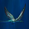
I'm working full-time at the moment, so that's why I've been missing a few days... but I'd rather do a few every other day, but good ones (Smile)")
Related content


Comments: 30


Beautiful colours and textures. I really like your style.
👍: 0 ⏩: 1

")

So, how do you go about choosing a pallet for the paintings in this series? Your colors are always stunning.
👍: 0 ⏩: 1

that's hard to say, it's usually quite random and also changes throughout the process of painting it
👍: 0 ⏩: 1
Aww, can't give me anymore protips than that? :c
👍: 0 ⏩: 1
not really... but you can watch this: www.youtube.com/watch?v=nWlwbQ…
👍: 0 ⏩: 1
Thank you! That gave me a bunch of good ideas!
What adjustment layers do you use?
👍: 0 ⏩: 1
I mostly use "Levels", "Brightness/Contrast", "Color Balance" and "Selective Color". But of course, I'm not saying that those are all you should use if you want to create a good image. Those are just the ones that I use...
👍: 0 ⏩: 0

You're getting a lot more depth in these now, and it's really nice to see C:
👍: 0 ⏩: 1
You're getting better and better each time! I hope you continue them!!
👍: 0 ⏩: 1

Nice feel! Overlay rules, but I can be mistaken ")
👍: 0 ⏩: 1

I think you'd benefit if you pushed your form and textures into finer detail, but that's also a matter of personal drive. Style's still fresh.
👍: 0 ⏩: 1

I often feel as though digital art lacks the aspect simplicity; letting the eye complete the image. I find, for me, the light blue adds this dream like air, as though there's something hiding in the mist, perhaps a hidden town, between the mountain and the viewer. Nice work!
Also the colour and lighting is beautiful! (:
👍: 0 ⏩: 1

wow. simply INCREDIBLE. how would someone like me learn how to do something like this? ;A;
👍: 0 ⏩: 2
it's just practice really...
👍: 0 ⏩: 0
The quickest way to learn seems to be to just start doing it. Your work isn't bad at all, so don't even worry about it.
👍: 0 ⏩: 0

You've escalated in proficiency quite sharply over the past few years. Your environmental scenes are quickly becoming on par with Tom Scholes' work.
👍: 0 ⏩: 1
Wow! thanks
I wouldn't quite agree with that, but I do LOVE his work!
👍: 0 ⏩: 1

For what it's worth, I was thinking the same thing as ~DestroyErase . I love Tom's work and this is really in the same realm to me. Really nice stuff here, man
👍: 0 ⏩: 1