HOME | DD
 michalivan — beastmaster

Published: 2010-09-17 10:41:06 +0000 UTC; Views: 41022; Favourites: 1001; Downloads: 829
Redirect to original
Description
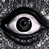
This was supposed to be a sketch for bigger scale traditional painting. But after adding color in photoshop I realised I like it as it is so I'm posting it. It still a sketch so don't look for detail (Smile)")
Pencil drawing colored in Photoshop
Related content


Comments: 38


")


i really liked.. it is so spontaneous .! keep drawing.
👍: 0 ⏩: 0


Epic antlers!
Life is a symphony and you are the conductor. By Kaizer913 who is me.
👍: 0 ⏩: 0

I forgot his name but I recognize that guy, the wolves are called the wild hunt I think
👍: 0 ⏩: 0


Very nice! It seems that people like depicting the Lord of the Wyld Hunt as handsome and romantic. It's refreshing to see a primal, horrifying take on him.
👍: 0 ⏩: 0


Wao i love it! it's "avant-guardist" (i don't know if it's the good word in english^^)
👍: 0 ⏩: 0

Dobrá práce... Výběr barev působí velice dobře a efektině.
👍: 0 ⏩: 0


Like the wolves, don't like the lazer-beam style harnesses.
👍: 0 ⏩: 0

this is phenomenally designed and put together. Pat yourself on the back!
👍: 0 ⏩: 0

I like the composition and how the direction lines contrast. Also the red vs cyan color is very effective.
👍: 0 ⏩: 0


 (Wink)")

I think it was a good decision. Sometimes pencil drawings have more life and enegry in them than a later colored photoshop image. I really like the energy in the movement and the insane touch of the figures. And the color gives it a nice touch of blood and death, especially on the antlers.
What i dont like about it are the hard color edges that cut through the beasts heads. They cut through your action lines from your drawn triangles and break some of the dynamic and confuse the viewer. If anithing would flow in one direction, or the directions you have already in your drawing it would nicely support the composition. I would align them with the lines you already have in your drawing or work more with a kind of gradient or soften the color edges out.
Good stuff! Keep on rocking man!
👍: 0 ⏩: 1

Excellent art work and also a thoughtful comment, which is always a pleasure to see.
Personally I like the hard colour edges on the triangles and the non comfority of the directions they point in. If the white tirangle behind the antlered figure was replaced with a circle or some other curved shape it would compliment the contours of the tines and enhance the contrast between the two aspects of the work, with the colour on the tines keeping them intergrated and nicely balanced.
I feel this would help the picture convey the feeling of chaos being unleashed but kept under control by the skill of its master, if thats the kind of thing your going for.
Once again, great piece of art.
👍: 0 ⏩: 0

And that's why I love you work... "unfinished" but looking good...
👍: 0 ⏩: 0
