HOME | DD
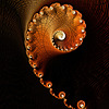
 Kaeltyk — Undersnow

Published: 2008-05-24 15:22:45 +0000 UTC; Views: 1039; Favourites: 29; Downloads: 0
Redirect to original
Description
Now that's better than the previous works !Advance critique very welcome, as I'd really like hearing some feedback on this piece that I think maybe my best Ultrafractal until now (?).
Ultrafractal • Inkscape for frame and text.
Related content


Comments: 22


Beautifully done.
The Pythagoras Tree is one of my favourites to "play" with. You've done a superb job.

👍: 0 ⏩: 0


A nice big render for my greedy cursor to traverse ")
👍: 0 ⏩: 0

I have nothing to criticise about this. Its very pleasing to look at, and brings to mind an elaborate exterior banister of some stately home
👍: 0 ⏩: 1

A lovely, stately fractal. From your title I would guess you intended to suggest a surface and structures underneath, which would be why you cut off the right-hand edge, For me, that works very well.
Now, how am I going to fit this on my desktop?
👍: 0 ⏩: 1

Thank you very much !
If you really want a desktop wallpaper out of this, I'll be glad to make one
👍: 0 ⏩: 1
Thanks for the offer! The resolution of this image is big enough for my desktop though, thanks.
👍: 0 ⏩: 0
Very nice, Eric. Excellent usage of negative space, and a very nicely composed piece overall. The gradient really gives it that 'snow and ice' feel, so your title is really made more powerful through it.
If I had one critique (sorry), it would be that the one edge of this beautiful design is cut off on the right side - it kind of cuts off the flow of the piece (but that might just be me!).
I don't know if this is your best piece, but it certainly is one of my faves. Excellent job. A very memorable piece! Take care!!
👍: 0 ⏩: 1
Thank you very much!
For the right part, unfortunately - as ususally for fractals - there are some parts that I don't want to show
👍: 0 ⏩: 0

I can't give you advanced critique. I can just say that this is very nice to look at closeup.
👍: 0 ⏩: 1
Merci beaucoup !
[Thank you very much !]
👍: 0 ⏩: 1
Le Français me convient tout à fait.
👍: 0 ⏩: 1
héhé je me doute bien, mais ça me fait toujours bizarre d'écrire en français sur un site anglais, alors je traduis pour les autres
 (Wink)")
👍: 0 ⏩: 1

My jaw dropped when i saw this..I agree with the comment above me for the most part.. But i do like the empty spaces at top and bottom...Makes it not so busy and just perfect..
👍: 0 ⏩: 1
Thank you very much !
I made spaces at top and bottom to make a less dense feeling, but I may add some (little) details there (as I answered the previous comment  (Smile)")
👍: 0 ⏩: 0

Wow. I think you're right about this being the best one. Since you asked for a critique, here's some of the things I noticed:
-The outside edge gives a very good 3D effect, kind of like looking at a planet
-The spiral offsets the geometry of the piece quite nicely, and leads the eye to take in the whole picture
-The addition of the brown and red hues is a good mix with the blues and whites.
-The only thing that seemed a little off was the top and bottom of the piece; it seems a little empty as compared to the rest. Perhaps zooming in and cropping the top and bottom a little would make it a little better
But all in all, I really like this one! Awesome job! I hope my critique helps a little. I always like when others can give me an idea as to how my work feels.
👍: 0 ⏩: 1
Thank you very much for your answer.
For the top and bottom, I added some space to avoid a very 'dense' fractal, made me feel more landscape/quiet/snowy. but I also though of adding some little details like moon and something on floor, so I may evolve it.
👍: 0 ⏩: 0