HOME | DD
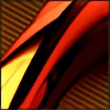
 Feni-x — alpha centaury

Published: 2005-05-06 18:43:05 +0000 UTC; Views: 3441; Favourites: 69; Downloads: 853
Redirect to original
Description
")
Related content


Comments: 39

stylish work.... and the render is good looking ... keep going
👍: 0 ⏩: 0


I would like to see that render from cinema 4d, really.
Good work, I see some nice details here.
👍: 0 ⏩: 0

 (Smile)")

")


")


__Please dont tell me that is made with BRYCE coz im gonna have a 


👍: 0 ⏩: 1

no man that made in cinema 4d ;]
thx bro
👍: 0 ⏩: 0


The shapes and everthing is great, but what I love the most is the very subtle color changes in the bg, wondeful job!
👍: 0 ⏩: 0

awesome, the closer you look, the better it is, lots of hidden details,
👍: 0 ⏩: 0


beautifull render, the small stroke of orange does the trick, well done
👍: 0 ⏩: 0

wow..itz beautiful.. do you have a bigger version i can use for wallpaper? 1600x1200?
👍: 0 ⏩: 0

really clean work m8!! love the mat u use on the render, also the render is nice too !
👍: 0 ⏩: 0


The more I look at this.. the better it gets. Great mix of subtle tech and organic forms. I love the sterility of the colours.
👍: 0 ⏩: 0


Very nice choice of color, I really like the small edge of gold. it adds to the design, and helps move the piece around.
One thing I would suggest is watching the 2D lines you have in there. There are some parts of it that looks TOO sharp, and too dirty. I dont know how it was achieved, but there are some parts that just take away from the design. these are the /'s and the -'s that go off to the right
If you have a smooth flow, try and keep it smooth, clean, and soft. You have the sharp text and such and thats great, but its a bit too much...it distracts
👍: 0 ⏩: 0


Pretty nice +fave..howd you do that render..its pretty nice...
👍: 0 ⏩: 0


Nice colors and espicially ,render
Wall version?
👍: 0 ⏩: 1


very nice. clean and simple....great work....//
 (Wink)")
👍: 0 ⏩: 0