HOME | DD
 estivador — grayscale painting

Published: 2013-06-21 19:13:42 +0000 UTC; Views: 7387; Favourites: 242; Downloads: 88
Redirect to original
Description
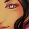
i need to practice more this stuff about start the painting for the grayscale. i never get this technique D= any tip?(did it quickly in the lunch time today)
i moved for a new apartment, very nice, with my girlfriend. and don't have internet at home yet =/ i'm dying with that, and doing all i can to finish the sketch commissions i already get to open more slots D=
Related content


Comments: 38

I want try this technique too.
Can be easier than paint with different color scale?
Sorry for my bad English)

👍: 0 ⏩: 1

I have a bit of difficult to use it. I think it have different results for each one.
👍: 0 ⏩: 0

Oh this is amazing! The depth is just so lively, and the colors added afterwards are very realistic! Ahh this is a very wonderful work!
Could i ask a question?
With what did you add the colors? with gradient maps, or some layer properties?
👍: 0 ⏩: 1
if i remember, i use layer properties, like color, overlay and hard lights. the color change the color (well.. obvious) but the colors look pale and weird, so you need a extra layer of overlay or something like that.
👍: 0 ⏩: 2

i was gonna ask the same thing since my grayscale painting attempts usually end weird and i did it once but i forgot the layer styles i used. this helps a lot  (Smile)")
👍: 0 ⏩: 1
glad to know it helps someone ^^
👍: 0 ⏩: 0
")

Really Oo danm.... you are good sir
👍: 0 ⏩: 0


ficou bem! qto tempo vc gastou com isso?
me cutuque depois no skype, eu te mostro uma dica pra fazer isso sem lama nas sombras.
👍: 0 ⏩: 1
gastei acho que menos de 1 hora. e se tiver umas dicas pra pintar do grayscale eu agradeço muito =o
👍: 0 ⏩: 0


Cara, pintar com preto e branco é uma maravilha, se preocupar apenas com volume e não com a cor é muito bom, só que tem várias observações no processo que podem tornar chato, se você deixar uma foto preto e branco vai perceber que nem todas as cores tem o mesmo "nivel" o cinza que fica de um amarelo pikachu é bem diferente do cinza que fica de um cinza do roxo do mewto (péssimos exemplos) então antes você tem que ter +/- mentalmente as cores que vai escolher, porque se não depois você vai ficar um tempão tentando ajusar o brilho e contraste pra acertar na cor que você quer, outra coisa ruim é que é dificil fazer transições de cores por luz e sombra, deixar a cor clara do objeto iluminado e a cor escura levemente roxo por exemplo.
É divertido porém tem esses detalhes que atrapalham, boa sorte : )
👍: 0 ⏩: 1
ha.. eu to ligado. mas dai vc dá aquele trato a mais no final. eu precisei fazer isso pelomenos, eu acho que ajuda a 'começar' melhor, geralmente eu refaço tudo pq não sabia por as cores, esse foi o primeiro teste que prestou mesmo =o
👍: 0 ⏩: 0

I think you did an awesome job D: Love the textures and great colors. . . I'll have to try this technique out sometime
👍: 0 ⏩: 1
thanks
")
👍: 0 ⏩: 0

Caramba, Vitor!!! Trabalho espetacular, parabéns!
Muito bacana!
👍: 0 ⏩: 1
thanks a lot
👍: 0 ⏩: 0

Very nice work man. ^^
I really like the 4th one. You could make it into a jade figure.
Stay inspired!
👍: 0 ⏩: 1
yeah, thanks, but this 'jade' looking make me put more colors to go back to the look of a stone statue
👍: 0 ⏩: 1


Dont get it? I swear from this process piece, you already got it. It's awesome
👍: 0 ⏩: 1
i never get a good result before this one. this is what i try to say
👍: 0 ⏩: 0

I have no idea how you did this- but great work.
👍: 0 ⏩: 1
grayscale tones with vivid light and color layers on top
👍: 0 ⏩: 1
Oh; what... I actually understood that. T-Thanks .-.
👍: 0 ⏩: 0

Niiiiiice! I love the gradient you have in there, and the slight texture speckle.
👍: 0 ⏩: 1

LOL this process is in reverse of how I work. In Photoshop I take my line art and color fully using three tones for each color used (dark, light and mid tone of color) to a dedicated layer. Always keeping my original color layers, I make a Combined Layer (ALL colors on one layer) then using LEVELS, Level it out to BLACK. Adjust the Opacity of that black layer to 30%-50% (Darker or lighter depending on what story you are trying to portray in the art) and use the eraser tool with an airbrush type tip (adjusting between 10%-50%) to define the highlights and the darks. If I need it to have SHINE, make a separate layer that you use the brush tool (airbrush tip again) the color WHITE to create your shine or specular color as I was taught the correct term LOL. Or just keep doing what you feel comfortable with.
👍: 0 ⏩: 1
well, its important to take a look and try different workflows to find something to fit with ourself, and never be closed to try something new
i think i already use something like you say, in quickly fixes of some jobs, to get a change of the contrast without re paint everything, just masking a darker version.. well. thanks for share a different process
👍: 0 ⏩: 0

valew rayner do meu coração
👍: 0 ⏩: 0